
Page 9 - graphic standards Demo
P. 9
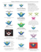
Region of Waterloo GRAPHIC STANDARDS and CORPORATE STYLE GUIDE 7 Incorrect Uses of
Do not condense or elongate symbol or type
the Corporate Image
This page shows examples of the incorrect use of the Corporate Image. Questions regarding use in print or electronic applications should be referred to the office of the Director of Corporate Communications in the office of the C.A.O., 519-575-4408
Do not centre straight line logotype above symbol
Do not change proportion between symbol and logotype (page 3)
Region of Waterloo
Do not replace logotype with a different typeface/font (See page 3)
Do not tilt the image graphic
Do not print one colour logo
in light colours or a screen of colour. When using one colour logo in a two- colour print job always print the logo in the darkest of the colours being used.
(See page 6)
Using the logo without the logotype can only be used with permission from Corporate Commiunications
When using one-colour logo do not print logo in one colour and logotype in another colour
Do not print four colour logo on a coloured background without surrounding white relief. (See page 5).
Do not use a straight reverse
of symbol. Always use surrounding white relief. (See page 5)
Lorem ipsum dolor sit amet, consectetuer
adipiscing elit, sed diam nonu mmy nibh euismod tincidunt ut laoreet
Do not crowd image graphic with secondary elements. See infringement guidelines (See pages 3, 4)
Do not use different colours in image
The Region Municipality of Waterloo
Do not substitute ’The Regional Munici- pality of Waterloo’ for ’Region of Water- loo’ in corporate graphic.
Do not use a low resolution or bitmapped corporate graphic.
