Page 69 - Visual Marketing
P. 69
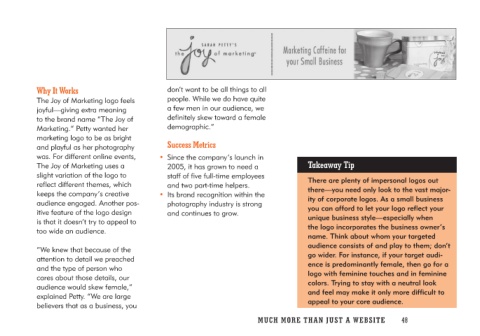
Why It Works                         don’t want to be all things to all
                                     people. While we do have quite
The Joy of Marketing logo feels      a few men in our audience, we
joyful—giving extra meaning          definitely skew toward a female
to the brand name “The Joy of        demographic.”
Marketing.” Petty wanted her
marketing logo to be as bright         Success Metrics                    Takeaway Tip
and playful as her photography
was. For different online events,    • Since the company’s launch in      There are plenty of impersonal logos out
The Joy of Marketing uses a             2005, it has grown to need a      there—you need only look to the vast major-
slight variation of the logo to         staff of five full-time employees  ity of corporate logos. As a small business
reflect different themes, which          and two part-time helpers.        you can afford to let your logo reflect your
keeps the company’s creative                                              unique business style—especially when
audience engaged. Another pos-       • Its brand recognition within the   the logo incorporates the business owner’s
itive feature of the logo design        photography industry is strong    name. Think about whom your targeted
is that it doesn’t try to appeal to     and continues to grow.            audience consists of and play to them; don’t
too wide an audience.                                                     go wider. For instance, if your target audi-
                                                                          ence is predominantly female, then go for a
“We knew that because of the                                              logo with feminine touches and in feminine
attention to detail we preached                                           colors. Trying to stay with a neutral look
and the type of person who                                                and feel may make it only more difficult to
cares about those details, our                                            appeal to your core audience.
audience would skew female,”
explained Petty. “We are large
believers that as a business, you

                                     MUCH MO RE THAN JUST A W E BS I TE 48

