Page 173 - Visual Marketing
P. 173
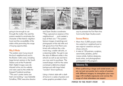
going to be enough to cut            and Open Studios coordinator.                 way to promote the Fort Point Arts
through the clutter. She said the    “They captured an essence of the              Community Open Studios event.
posters needed to emphasize the      neighborhood . . . and created a
character of the historic neighbor-  buzz of their own.” The posters             Success Metrics
hood and the accessibility of the    feature images of paintings and
artists while promoting the range    photographs of the old mills and          • More than 5,000 people visited
of buying opportunities.             loft spaces from Fort Point com-              the waterfront neighborhood to
                                     bined with artifacts like a dia-              see original creations and pur-
Why It Works                         mond ring, a stylish old sofa, or             chase artwork.
                                     a steaming kettle. You get to see
The posters were hung around         the style of different artists in the     • A total of 150 painters, sculptors,
the local neighborhood and in        artwork as well as see real items             ceramicists, jewelers, perfor-
the Boston metro area, including     you may want to purchase. The                 mance artists, fashion designers,
large-format versions in the South   overall design motif for the series           book artists, and photographers
Station and at the Prudential        contained a distinctive striped               participated in the program.
Mall. Digital images were dis-       background with large faded
tributed online via the website      “wooden” block typefaces.                  Takeaway Tip
and were used by the artists for
frequent Facebook postings.          Using a historic style with a dash           When publicizing a large and varied event, cre-
“This year’s poster series was       of humor in a series of posters and          ate not just one poster but a series of posters
fresh and exciting,” says Gabrielle  online graphics provided a fresh             with different imagery to strengthen your mes-
Schaffner, FPAC executive director                                                sage with multiple exposures and convey the
                                                                                  range of what attendees can expect.

                                                                            PO WER TO THE PR I N T I TE M ! 152

