Page 171 - Visual Marketing
P. 171
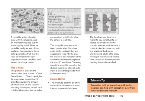
A makelike writer attended            personalized insight into what        • The brochure went out as a
class with the students, and          the school is really like.               mailer to key constituents, is
an illustrator mapped out the                                                  hosted as a flipbook on the
landscape by hand. Then, as           This pamphlet turns the tradi-           school’s website, and became a
makelike designer Mary Kysar          tional private school brochure           poster tacked to classroom walls
explains, they created a three-       on its ear by making it fun and          and students’ bedrooms.
color publication that may be         engaging to read. “In the end,
read as a traditional eight-          the piece is a true reflection of the  • Children and adults alike enjoy
page brochure or unfolded and         innovative and infectious spirit of      looking at the map and finding
viewed as a large poster.             the school,” says Kysar. “Learning       their corners of the campus and
                                      about the school by mirroring the        reading the words attached.
Why It Works                          student experience allowed us to
                                      make a piece that spoke to them
The pamphlet plays on the             in their own voice.”
rumors about the school (“Catlin
Gabel is not . . .”) and highlights     Success Metrics                     Takeaway Tip
its progressive perspective. It
provides a surprising amount          • The brochure became an effec-       Reputation isn’t permanent. A solid market-
of information on the school’s           tive tool for admissions to raise  ing piece can help shift perception away from
teaching philosophy, as well as a        interest in potential students.    rumor and toward the truth.
childlike illustration that provides

                                                                            PO WER TO THE PR I N T I TE M ! 150

