Page 189 - Visual Marketing
P. 189
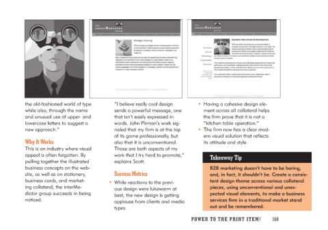
the old-fashioned world of type      “I believe really cool design      • Having a cohesive design ele-
while also, through the name         sends a powerful message, one         ment across all collateral helps
and unusual use of upper- and        that isn’t easily expressed in        the firm prove that it is not a
lowercase letters to suggest a       words. John Pirman’s work sig-        “kitchen table operation.”
new approach.”                       naled that my firm is at the top
                                     of its game professionally, but    • The firm now has a clear mod-
Why It Works                         also that it is unconventional.       ern visual solution that reflects
                                     Those are both aspects of my          its attitude and style.
This is an industry where visual     work that I try hard to promote,”
appeal is often forgotten. By        explains Scott.                         Takeaway Tip
pulling together the illustrated
business concepts on the web-       Success Metrics                            B2B marketing doesn’t have to be boring,
site, as well as on stationery,                                                and, in fact, it shouldn’t be. Create a consis-
business cards, and market-       • While reactions to the previ-              tent design theme across various collateral
ing collateral, the interMe-         ous design were lukewarm at               pieces, using unconventional and unex-
diator group succeeds in being       best, the new design is getting           pected visual elements, to make a business
noticed.                             applause from clients and media           services firm in a traditional market stand
                                     types.                                    out and be remembered.

                                                                        PO WER TO THE PR I N T I TE M ! 168

