Page 37 - final flipbook
P. 37
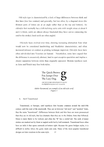
Old style type is characterized by a lack of large differences between thick and

                   thin lines (low line contrast) and generally, but less often, by a diagonal stress (the

                   thinnest parts of letters are at an angle rather than at the top and bottom). An
                   old-style font normally has a left-inclining curve axis with weight stress at about 8

                   and 2 o'clock; serifs are almost always bracketed (they have curves connecting the
                   serif to the stroke); head serifs are often angled.


                        Old-style faces evolved over time, showing increasing abstraction from what
                   would now be considered handwriting and blackletter characteristics, and often

                   increased delicacy or contrast as printing technique improved. Old-style faces have
                   often sub-divided into Venetian (or humani    Nonetheless, some have argued that

                   the difference is excessively abstract, hard to spot except to specialists and implies a
                   clearer separation between styles than originally appeared. Modern typefaces such

                   as Arno and Trinité may fuse both styles.


                                        Adobe Garamond, an example of an old-style serif.
                                                           Figure 1


                       b.  Serif Transitional


                        Transitional, or baroque, serif typefaces first became common around the mid-18th
                   century until the start of the nineteenth. They are in between "old style" and "modern" fonts,
                   thus the name "transitional". Differences between thick and thin lines are more pronounced

                   than they are in old style, but less dramatic than they are in the Didone fonts that followed.
                   Stress is more likely to be vertical, and often the "R" has a curled tail. The ends of many
                   strokes are marked not by blunt or angled serifs but by ball terminals. Transitional faces often

                   have an italic h that opens outwards at bottom right. Because the genre bridges styles, it is
                   difficult to define where the genre starts and ends. Many of the most popular transitional

                   designs are later creations in the same style.  37

