Page 39 - final flipbook
P. 39
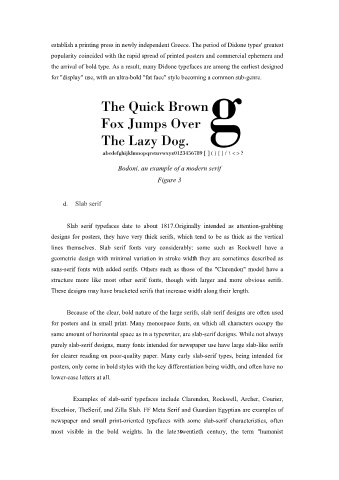
establish a printing press in newly independent Greece. The period of Didone types' greatest
                   popularity coincided with the rapid spread of printed posters and commercial ephemera and

                   the arrival of bold type. As a result, many Didone typefaces are among the earliest designed
                   for "display" use, with an ultra-bold "fat face" style becoming a common sub-genre.


                                          Bodoni, an example of a modern serif
                                                        Figure 3


                       d.  Slab serif


                        Slab serif typefaces date to about 1817.Originally intended as attention-grabbing

                   designs for posters, they have very thick serifs, which tend to be as thick as the vertical
                   lines themselves. Slab serif fonts vary considerably: some such as Rockwell have a

                   geometric design with minimal variation in stroke width they are sometimes described as
                   sans-serif fonts with added serifs. Others such as those of the "Clarendon" model have a
                   structure more like most other serif fonts, though with larger and more obvious serifs.

                   These designs may have bracketed serifs that increase width along their length.


                        Because of the clear, bold nature of the large serifs, slab serif designs are often used
                   for posters and in small print. Many monospace fonts, on which all characters occupy the
                   same amount of horizontal space as in a typewriter, are slab-serif designs. While not always

                   purely slab-serif designs, many fonts intended for newspaper use have large slab-like serifs
                   for clearer reading on poor-quality paper. Many early slab-serif types, being intended for
                   posters, only come in bold styles with the key differentiation being width, and often have no

                   lower-case letters at all.


                           Examples of slab-serif typefaces include Clarendon, Rockwell, Archer, Courier,

                   Excelsior, TheSerif, and Zilla Slab. FF Meta Serif and Guardian Egyptian are examples of
                   newspaper and small print-oriented typefaces with some slab-serif characteristics, often

                   most visible in the bold weights. In the late 39 twentieth century, the term "humanist

