Page 38 - final flipbook
P. 38
Fonts from the original period of transitional typefaces include early on the "romain du
                   roi" in France, then the work of Pierre Simon Fournier in France, Fleischman and Rosart in

                   the Netherlands, Pradel in Spain and John Baskerville and Bulmer in England. Among more
                   recent designs, Times New Roman (1932), Perpetua, Plantin, Mrs. Eaves, Freight Text and
                   the earlier "modernised old styles" have been described as transitional in design.


                        Later 18th-century transitional typefaces in Britain begin to show influences of Didone

                   typefaces from Europe, described below, and the two genres blur, especially in type intended
                   for body text; Bell is an example of this.


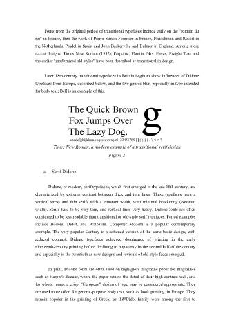
                            Times New Roman, a modern example of a transitional serif design
                                                        Figure 2


                       c.  Serif Didone


                          Didone, or modern, serif typefaces, which first emerged in the late 18th century, are

                   characterized by extreme contrast between thick and thin lines. These typefaces have a
                   vertical stress and thin serifs with a constant width, with minimal bracketing (constant
                   width). Serifs tend to be very thin, and vertical lines very heavy. Didone fonts are often

                   considered to be less readable than transitional or old-style serif typefaces. Period examples
                   include Bodoni, Didot, and Walbaum. Computer Modern is a popular contemporary
                   example. The very popular Century is a softened version of the same basic design, with

                   reduced contrast. Didone typefaces achieved dominance of printing in the early
                   nineteenth-century printing before declining in popularity in the second half of the century

                   and especially in the twentieth as new designs and revivals of old-style faces emerged.


                          In print, Didone fonts are often used on high-gloss magazine paper for magazines

                   such as Harper's Bazaar, where the paper retains the detail of their high contrast well, and
                   for whose image a crisp, "European" design of type may be considered appropriate. They
                   are used more often for general-purpose body text, such as book printing, in Europe. They

                   remain popular in the printing of Greek, as the 38Didot family were among the first to

