Page 63 - FASTSIGNS Case Study Book
P. 63
Maggie McFly’s                                                               RETAIL/RESTAURANT


            Maggie McFly’s Brand Soars with Signs and Graphics
            The Challenge                                        which matched the painted logo on the exterior of the
            With nine locations, Maggie McFly’s restaurant entered a   building to complete the Maggie McFly’s brand feel .
            new market . They needed fresh new signage that would
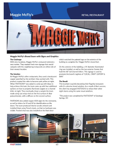
            compete with the neighboring restaurants on either side of   On the exterior of the building, a 14’ diameter illuminated
            their newest location.                               ring was installed, as well as the two exterior frames that
                                                                 hold the 48” tall channel letters. This signage is used to
            The Solution                                         promote the brand’s taglines of “LOCAL, CRAFT, EATERY &
            At Maggie McFly’s other restaurants, they used a translucent   BAR .”
            copper specified by the architect they worked with. This
            product created the color to become pale yellow at night .   The Result
            When FASTSIGNS  was asked to come up with ideas to   This location is quickly becoming their flagship restaurant
                           ®
            help achieve this look, the team came up with four additional   with it’s cohesive brand solution. As a result of their success,
            options on how to properly illuminate copper on a channel   the client has engaged FASTSIGNS to reface their other
            letter at night. They eventually chose a sample the team   eight stores using the same visual solutions.
            made using cast wrap vinyl on the first surface of clear
                                                                                                    ®
            polycarbonate, with a diffuser on the second surface.   *This project was completed by FASTSIGNS  of Saratoga
                                                                 Springs, NY.
            FASTSIGNS also added copper ADA signs for the restrooms,
            as well as letters for M and W for identification on the
            doors . The team produced interior acrylic artwork and
            installed them using French cleats, so that no hardware was
            visible . Frosted vinyl was also installed on the front door


                                                             63

