Page 18 - House Style of Sketching_2023_Rev3
P. 18
Learners can often be fearful of this sketching style due to their perceived
                                                                                         notion of how it should look.  They resort to drawing pictures.  It is a
                                                                                         combination of 3-dimensional perspective and orthographic views that is
                                                                                         about understanding ideas.  Pages will not be identical or perfect.  It is fine to
                                                                                         make mistakes.  Mistakes can be good!  Don’t erase them, just move on
                                                                                         exploring the next avenue.  A reader of this sketching style should be able
                                                                                         follow the thought pattern.


     sketching styles
                                                                                                                 GO MAKE MISTAKES


                                                                                         Through a design process there can be a tendency for learners to try
                                                                                         make sheets ‘look good’ or formal,  This defeats the purpose of iterative
                                                                                         sketching as the thought process is not linear or always clear.   Iterative
                                                                                         sketching engages with ambiguity and through the process moments of
                                                                                         understanding and inspiration emerge.  Practice and experience will see
                                                                                         an improvement in the overall feel, look and style of sketch sheet. Always
                                                                                         remember the reason for sketching.

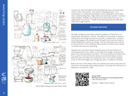
                                                                                         Opposite are two sketch sheets showing some of the key features of
                                                                                         concept generation. the column on the right of the page can guide and
                                                                                         help in the understanding of the sheet. The three sections are broken into,
                                                                                         focus, points of note and actions arising. Concept sketching is a loose
                                                                                         style that does not inhibit the creative process. There will be mistakes,
                                                                                         some of which will trigger your thought process in a different direction.
                                                                                         Notice the flow of the sheets. They are nonlinear and more in line with how
                                                                                         your mind can meander when being creative. It can often be referred to as
                                                                                         taking your concept for a walk.


                                                                                                                   Design Skills -
                                                                                                                   Moving from research to concept generation
                                                                                                                   Hilary Dempsey 2020

                                                                                                                   YouTube - Design Carlow Channel
                                             Fig 3.3 Hilary Dempsey Concept Sheets 2020


     12

