Page 50 - fredo Eyong
P. 50
In developing the high-fidelity prototype of the app, I focused on
             refining two key access points: the Sign-Up and login routes. This was
             a direct response to the feedback we received on the initial
             low-fidelity prototype.
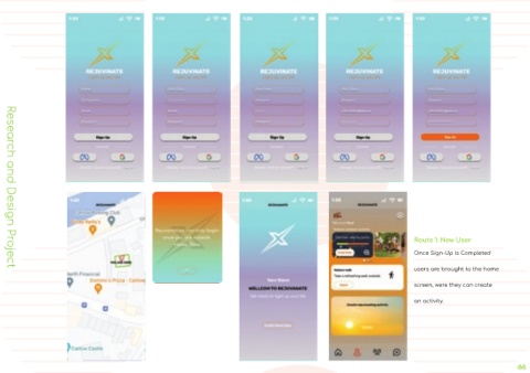
             I designed the sign-up route to be an inviting first touchpoint for new
             users, ensuring it was both user-friendly and secure. By collecting
             essential information and implementing a verification step, I aimed to
             establish a trustworthy environment for our community’s growth.
             The login route was tailored for existing users, providing them with a
             hassle-free way to re-engage with the app. It was important to me
             that they felt a sense of continuity and ease each time they returned.
             My decision to create these separate but complementary pathways
             was driven by the desire to cater to the distinct experiences of new
             and returning users. It is about striking the right balance and making
             newcomers feel guided and supported while allowing seasoned users
             to access the app’s features swiftly. This approach not only
             streamlines the user journey but also reinforces the app’s
             commitment to a seamless user experience.
                    Route 1: New User
                    Once Sign-Up is Completed
                    users are brought to the home
  Research and Design Project
                    screen, were they can create
                    an activity.

