
Page 46 - fredo Eyong
P. 46
Branding
I would like to emphasise that while developing the low-fidelity
prototypes, I was simultaneously engaged in conceptualising the
branding. This parallel process was crucial because it allowed me to
ensure that the prototypes aligned with the brand’s evolving identity
and values.
After several iterations, I finally settled on the perfect brand name
and logo that truly resonated with the essence of the brand vision. It
was a moment of clarity when everything just clicked into place. With
the foundation set, I crafted a tagline that encapsulated the brand’s
spirit and a mission statement that articulated the purpose and
direction.
I delved deep into understanding the position in the market,
conducting a thorough SWOT analysis to identify the strengths,
weaknesses, opportunities, and threats. This strategic evaluation was
Wander Well ,Wilderness Whisper
complemented by a comparative analysis, which allowed me to gauge
Wild Wing, Fresh Feet, Shine Up
the brand against competitors and carve out a unique niche for it.
Wanderlust Way, Sunshine Up, Trail Bliss
Eco Muse, Green Glow Guide, Open Sky
Core values are the pillars of a brand, and I took great care in
defining them. Choosing a typeface was like choosing the voice of the
Eco Vibe, Blom Boost, Wild Wish
Xhale, Fresh Air
brand – it needed to be distinctive and reflective of the brand
Rejuvenate
personality.
Chapter 05: Prototype
Branding
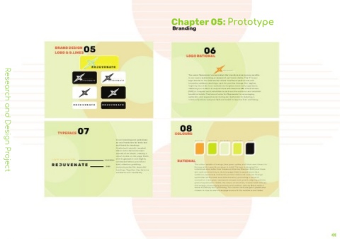
BRAND DESIGN 05
LOGO & G.LINES 06
LOGO RATIONAL
REJUVEN ATE
Light up your life
Light up your life
REJUVEN ATE
The name ‘Rejuvenate’ encapsulates the transformative journey we offer
logo stands for the intersection where traditional paths cross with
Light up your life
REJUV EN ATE Light up your life REJUV EN ATE to our users, symbolizing a renewal of
innovative wellness, marking a spot for positive change. Our tagline,
‘Light Up Your Life,’ is an invitation to brighten one’s daily experience,
reflecting our mission to inspire those with Seasonal Affe ctive Disorder
(SAD) or irregular work schedules to embrace the outdoors and establish
beneficial habits. The tone of voice for ‘Rejuvenate’ is encouraging,
optimistic, and supportive, mirroring our dedication to fostering a
community where everyone feels motivated to improve their well-being.
REJUVEN ATE REJUVEN ATE
Light up your life Light up your life
TYPEFACE07 COLOURS 08
In our branding and guidelines, R251 G176 B64 R216 G242 B5 R236 G240 B205 R237
we use Comfortaa for body text
and Rubik for headings.
Comfortaa’s smooth, rounded
letters echo the harmonious
sounds of our band, creating a
visual rhythm on the page. Rubik,
Light up your life COMFORTAA with its geometric and slightly RATIONAL
REJUVEN ATE RUBIK bold, attention-grabbing The colour palette of orange, lime green
condensed letters, provides a
individuals who suffer from Seasonal Aff ective Disorder (SAD) and those
the app with a specific purpose in mind. The app is designed for
contrast, perfect for impactful
aesthetics and readability.
Research and Design Project
headings. Together, they balance who work unsocial hours, to encourage them to sp
outdoors, rejuvenate, and build positive habits and routines. Orange
symbolizes enthusiasm and determination, promoting a sense of
motivation. Lime green represents renewal and growth, aligning with the
goal of rejuvenation. Yellow, the colour of sunshine, is associated with joy
and energy, encouraging positivity and outdoor activity. Black adds a
sense of stability and grounding. This vibrant and energetic palette was
chosen to inspire users to engage more with the outdoors and foster