
Page 44 - fredo Eyong
P. 44
Chapter 05: Prototype
Low Fidelity Prototype & Branding
Branding
The creation of brand and marketing assets was a thrilling process,
I would like to emphasise that while developing the low-fidelity
as each element from the colour palette to the design subjects was a
prototypes, I was simultaneously engaged in conceptualising the
piece of a larger story we were telling. The colour palette, in
branding. This parallel process was crucial because it allowed me to
particular, was chosen to evoke the emotions and values the brand
ensure that the prototypes aligned with the brand’s evolving identity
stands for.
and values.
After several iterations, I finally settled on the perfect brand name
Finally, I compiled a brand rationale document that outlined the
and logo that truly resonated with the essence of the brand vision. It
reasoning behind every choice made, from the visual identity to the
was a moment of clarity when everything just clicked into place. With
strategic positioning. It serves as a blueprint that ensures every
the foundation set, I crafted a tagline that encapsulated the brand’s
aspect of the brand aligns with the brand's overarching goals and
spirit and a mission statement that articulated the purpose and
communicates the message effectively
direction.
I delved deep into understanding the position in the market,
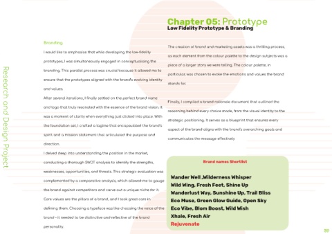
conducting a thorough SWOT analysis to identify the strengths, Brand names Shortlist
Research and Design Project
weaknesses, opportunities, and threats. This strategic evaluation was
Wander Well ,Wilderness Whisper
complemented by a comparative analysis, which allowed me to gauge
Wild Wing, Fresh Feet, Shine Up
the brand against competitors and carve out a unique niche for it. Wanderlust Way, Suns
Core values are the pillars of a brand, and I took great care in Eco Muse, Green Glow
defining them. Choosing a typeface was like choosing the voice of the Eco Vibe, Blom Bo
Xhale, Fresh Air
brand – it needed to be distinctive and reflective of the brand
personality. Rejuvenate