Page 47 - PAM - PROOF
P. 47
V 1.1 February 2024

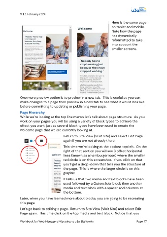
                                                                                 Here is the same page
                                                                                 on tablet and mobile.
                                                                                 Note how the page
                                                                                 has dynamically
                                                                                 reformatted to take
                                                                                 into account the
                                                                                 smaller screens.


               One more preview option is to preview in a new tab.  This is useful as you can
               make changes to a page then preview in a new tab to see what it would look like
               before committing to updating or publishing your page.

               Page Hierarchy
               While we’re looking at the top line menus let’s talk about page structure.  As you
               work on your pages you will be using a variety of block types to achieve the
               effect you want, just as several block types have been used to create the
               welcome page that we are currently looking at.

                                              Return to Site View (Visit Site) and select Edit Page
                                              again if you are not already there.

                                              This time we’re looking at the options top left.  On the
                                              right of that section you will see 3 offset horizontal
                                              lines (known as a hamburger icon) where the smaller
                                              red circle is on this screenshot.  If you click on that
                                              you’ll get a drop-down that tells you the structure of
                                              the page.  This is where the larger circle is on this
                                              graphic.
                                              It tells us that two media and text blocks have been
                                              used followed by a Gutenslider block then another
                                              media and text block with a spacer and columns at
                                              the bottom.

               Later, when you have learned more about blocks, you are going to be recreating
               this page.

               Let’s go back to editing a page.  Return to Site View (Visit Site) and select Edit
               Page again.  This time click on the top media and text block.  Notice that you


               Workbook for Web Managers Migrating to u3a SiteWorks                               Page 47

