Page 164 - Krugmans Economics for AP Text Book_Neat
P. 164
Growth and Unemployment

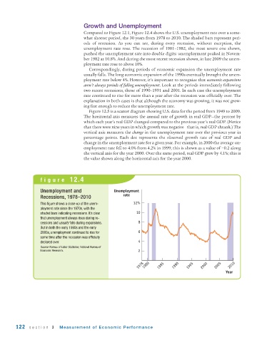
                                       Compared to Figure 12.1, Figure 12.4 shows the U.S. unemployment rate over a some-
                                       what shorter period, the 30 years from 1978 to 2010. The shaded bars represent peri-
                                       ods of recession. As you can see, during every recession, without exception, the
                                       unemployment rate rose. The recession of 1981–1982, the most severe one shown,
                                       pushed the unemployment rate into double digits: unemployment peaked in Novem-
                                       ber 1982 at 10.8%. And during the most recent recession shown, in late 2009 the unem-
                                       ployment rate rose to above 10%.
                                          Correspondingly, during periods of economic expansion the unemployment rate
                                       usually falls. The long economic expansion of the 1990s eventually brought the unem-
                                       ployment rate below 4%. However, it’s important to recognize that economic expansions
                                       aren’t always periods of falling unemployment. Look at the periods immediately following
                                       two recent recessions, those of 1990–1991 and 2001. In each case the unemployment
                                       rate continued to rise for more than a year after the recession was officially over. The
                                       explanation in both cases is that although the economy was growing, it was not grow-
                                       ing fast enough to reduce the unemployment rate.
                                          Figure 12.5 is a scatter diagram showing U.S. data for the period from 1949 to 2009.
                                       The horizontal axis measures the annual rate of growth in real GDP—the percent by
                                       which each year’s real GDP changed compared to the previous year’s real GDP. (Notice
                                       that there were nine years in which growth was negative—that is, real GDP shrank.) The
                                       vertical axis measures the change in the unemployment rate over the previous year in
                                       percentage points. Each dot represents the observed growth rate of real GDP and
                                       change in the unemployment rate for a given year. For example, in 2000 the average un-
                                       employment rate fell to 4.0% from 4.2% in 1999; this is shown as a value of −0.2 along
                                       the vertical axis for the year 2000. Over the same period, real GDP grew by 4.1%; this is
                                       the value shown along the horizontal axis for the year 2000.


                    figure  12.4

                    Unemployment and                 Unemployment
                                                         rate
                    Recessions, 1978–2010
                    This figure shows a close - up of the unem-  12%
                    ployment rate since the 1970s, with the
                    shaded bars indicating recessions. It’s clear  10
                    that unemployment always rises during re-
                    cessions and usually falls during expansions.  8
                    But in both the early 1990s and the early
                    2000s, unemployment continued to rise for   6
                    some time after the recession was officially
                    declared over.                              4
                    Source: Bureau of Labor Statistics; National Bureau of
                    Economic Research.                          2


                                                                1978  1980  1985  1990  1995  2000  2005  2010
                                                                                                         Year


        122   section  3    Measurement of Economic Performance

