Page 558 - Krugmans Economics for AP Text Book_Neat
P. 558
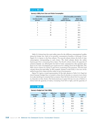
table 51.1

                                         Sammy’s Utility from Clam and Potato Consumption

                                               Utility from clam consumption      Utility from potato consumption
                                           Quantity of clams   Utility from      Quantity of      Utility from
                                              (pounds)       clams (utils)    potatoes (pounds)  potatoes (utils)
                                                0                 0                  0               0
                                                1                15                  1              11.5
                                                2                25                  2              21.4
                                                3                31                  3              29.8
                                                4                34                  4              36.8
                                                5                36                  5              42.5
                                                                                     6              47.0
                                                                                     7              50.5
                                                                                     8              53.2
                                                                                     9              55.2
                                                                                    10              56.7


                                          Table 51.2 shows how his total utility varies for the different consumption bundles
                                       along his budget line. Each of six possible consumption bundles, A through F from
                                       Figure 51.2, is given in the first column. The second column shows the level of clam
                                       consumption corresponding to each choice. The third column shows the utility
                                       Sammy gets from consuming those clams. The fourth column shows the quantity of
                                       potatoes Sammy can afford given the level of clam consumption; this quantity goes
                                       down as his clam consumption goes up because he is sliding down the budget line. The
                                       fifth column shows the utility he gets from consuming those potatoes. And the final
                                       column shows his total utility. In this example, Sammy’s total utility is the sum of the
                                       utility he gets from clams and the utility he gets from potatoes.
                                          Figure 51.3 gives a visual representation of the data shown in Table 51.2. Panel (a)
                                       shows Sammy’s budget line, to remind us that when he decides to consume more clams
                                       he is also deciding to consume fewer potatoes. Panel (b) then shows how his total util-
                                       ity depends on that choice. The horizontal axis in panel (b) has two sets of labels: it
                                       shows both the quantity of clams, increasing from left to right, and the quantity of


                                        table 51.2

                                         Sammy’s Budget and Total Utility

                                                      Quantity of  Utility from  Quantity of  Utility from
                                         Consumption   clams       clams      potatoes    potatoes    Total utility
                                           bundle      (pounds)     (utils)    (pounds)     (utils)     (utils)
                                             A           0           0          10          56.7        56.7
                                             B           1           15          8          53.2        68.2
                                             C           2           25          6          47.0        72.0
                                             D           3           31          4          36.8        67.8
                                             E           4           34          2          21.4        55.4
                                             F           5           36          0           0          36.0


        516   section 9     Behind the Demand Curve: Consumer Choice

