Page 84 - Krugmans Economics for AP Text Book_Neat
P. 84
Graphs That Depict Numerical Information

                                       Graphs can also be used as a convenient way to summarize and display data without as-
                                       suming some underlying causal relationship. Graphs that simply display numerical in-
                                       formation are called numerical graphs. Here we will consider four types of numerical
                                       graphs: time-series graphs, scatter diagrams, pie charts, and bar graphs. These are widely used
                                       to display real empirical data about different economic variables, because they often
                                       help economists and policy makers identify patterns or trends in the economy.

                                       Types of Numerical Graphs
                                       You have probably seen graphs in newspapers that show what has happened over
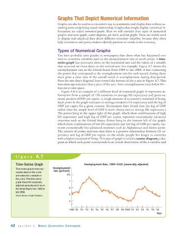
                                       time to economic variables such as the unemployment rate or stock prices. A time-
                                       series graph has successive dates on the horizontal axis and the values of a variable
                                       that occurred on those dates on the vertical axis. For example, Figure A.7 shows the
                                       unemployment rate in the United States from 1989 to late 2006. A line connecting
                                       the points that correspond to the unemployment rate for each month during those
                                       years gives a clear idea of the overall trend in unemployment during that period.
                                       Note the two short diagonal lines toward the bottom of the y-axis in Figure A.7. This
                                       truncation sign indicates that a piece of the axis—here, unemployment rates below 4%—
                                       was cut to save space.
                                          Figure A.8 is an example of a different kind of numerical graph. It represents in-
                                       formation from a sample of 158 countries on average life expectancy and gross na-
                                       tional product (GNP) per capita—a rough measure of a country’s standard of living.
                                       Each point in the graph indicates an average resident’s life expectancy and the log of
                                       GNP per capita for a given country. (Economists have found that the log of GNP
                                       rather than the simple level of GNP is more closely tied to average life expectancy.)
                                       The points lying in the upper right of the graph, which show combinations of high
                                       life expectancy and high log of GNP per capita, represent economically advanced
                                       countries such as the United States. Points lying in the bottom left of the graph,
                                       which show combinations of low life expectancy and low log of GNP per capita, rep-
                                       resent economically less advanced countries such as Afghanistan and Sierra Leone.
                                       The pattern of points indicates that there is a positive relationship between life ex-
                                       pectancy and log of GNP per capita: on the whole, people live longer in countries
                                       with a higher standard of living. This type of graph is called a scatter diagram, a dia-
                                       gram in which each point corresponds to an actual observation of the x-variable and


           figure  A.7


           Time-Series Graph                             Unemployment Rate, 1989–2006 (seasonally adjusted)
           Time-series graphs show suc-  Unemployment
                                     rate (percent)
           cessive dates on the x-axis
           and values for a variable on       8%
           the y-axis. This time-series
           graph shows the seasonally          7
           adjusted unemployment rate in
           the United States from 1989 to      6
           late 2006.
                                               5
           Source: Bureau of Labor Statistics.
                                               4

                                               1989 ’90  ’91 ’92  ’93  ’94  ’95  ’96  ’97 ’98  ’99  2000  ’01 ’02 ’03 ’04 ’05 ’06
                                                                                                         Year


        42   section  I   Basic Economic Concepts

