
Page 13 - AV Presentations - Student Textbook
P. 13
(https://www.hongkiat.com/blog/golden-ratio-in-moden-designs/)
The Golden Ratio
Used in design, architecture, and engineering, the Golden Ratio is “one where the ratio of the smaller
segment to the larger segment is the same as the larger segment to the sum of both segments.”
How do you apply the Golden Ratio to your visual content?
Check if your image is golden. Divide the image’s width by its height. If the answer is 1.618 or 0.618,
the image is perfect to use. For example, say you have a 647×400 image: multiply 647/400=1.617 and
400/647=0.616, which mean this image is perfect to use.
Calculate the perfect size for your images. For example, say the height of your image is 350 pixels:
multiply 350 to 1.618, and you will get the perfect width for the image – 566 pixels.
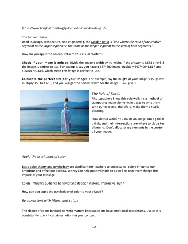
The Rule of Thirds
Photographers know this rule well: it’s a method of
composing image elements in a way to sync them
with our eyes and, therefore, make them visually
pleasing.
How does it work? You divide an image into a grid of
thirds, and their intersections are where to place key
elements. Don’t allocate key elements in the center
of your image.
Apply the psychology of color
Basic color theory and psychology are significant for teachers to understand: colors influence our
emotions and affect our actions, so they can help positively add to as well as negatively change the
impact of your message.
Colors influence audience behavior and decision making. Impressive, huh?
How can you apply the psychology of color to your visuals?
Be consistent with filters and colors
The choice of colors in visual content matters because colors have emotional associations. Use colors
consistently to elicit certain emotions in your content.
12