Page 31 - THE MATHMATE November 2024
P. 31
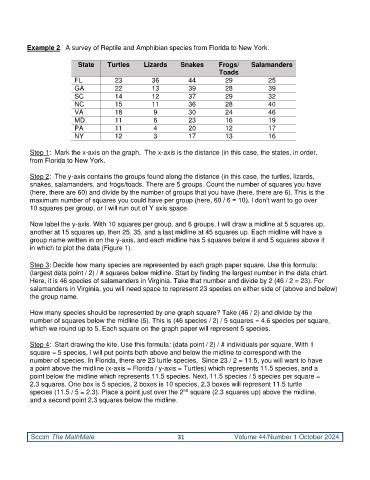
Example 2.  A survey of Reptile and Amphibian species from Florida to New York.

                           State     Turtles     Lizards     Snakes      Frogs/     Salamanders
                                                                          Toads
                          FL           23          36          44           29            25
                          GA           22          13          39           28            39
                          SC           14          12          37           29            32
                          NC           15          11          36           28            40
                          VA           18           9          30           24            46
                          MD           11           6          23           16            19
                          PA           11           4          20           12            17
                          NY           12           3          17           13            16

           Step 1:  Mark the x-axis on the graph.  The x-axis is the distance (in this case, the states, in order,
           from Florida to New York.

           Step 2:  The y-axis contains the groups found along the distance (in this case, the turtles, lizards,
           snakes, salamanders, and frogs/toads. There are 5 groups. Count the number of squares you have
           (here, there are 60) and divide by the number of groups that you have (here, there are 6). This is the
           maximum number of squares you could have per group (here, 60 / 6 = 10). I don’t want to go over
           10 squares per group, or I will run out of Y axis space.

           Now label the y-axis. With 10 squares per group, and 6 groups, I will draw a midline at 5 squares up,
           another at 15 squares up, then 25, 35, and a last midline at 45 squares up. Each midline will have a
           group name written in on the y-axis, and each midline has 5 squares below it and 5 squares above it
           in which to plot the data (Figure 1).

           Step 3: Decide how many species are represented by each graph paper square. Use this formula:
           (largest data point / 2) / # squares below midline. Start by finding the largest number in the data chart.
           Here, it is 46 species of salamanders in Virginia. Take that number and divide by 2 (46 / 2 = 23). For
           salamanders in Virginia, you will need space to represent 23 species on either side of (above and below)
           the group name.

           How many species should be represented by one graph square? Take (46 / 2) and divide by the
           number of squares below the midline (5). This is (46 species / 2) / 5 squares = 4.6 species per square,
           which we round up to 5. Each square on the graph paper will represent 5 species.

           Step 4:  Start drawing the kite. Use this formula: (data point / 2) / # individuals per square. With 1
           square = 5 species, I will put points both above and below the midline to correspond with the
           number of species. In Florida, there are 23 turtle species.  Since 23 / 2 = 11.5, you will want to have
           a point above the midline (x-axis = Florida / y-axis = Turtles) which represents 11.5 species, and a
           point below the midline which represents 11.5 species. Next, 11.5 species / 5 species per square =
           2.3 squares. One box is 5 species, 2 boxes is 10 species, 2.3 boxes will represent 11.5 turtle
                                                              nd
           species (11.5 / 5 = 2.3). Place a point just over the 2  square (2.3 squares up) above the midline,
           and a second point 2.3 squares below the midline.


           Scctm The MathMate                               31                 Volume 44/Number 1 October 2024

