
Page 467 - Microeconomics, Fourth Edition
P. 467
c11monopolyandmonopsony.qxd 7/14/10 7:58 PM Page 441
11.1 PROFIT MAXIMIZATION BY A MONOPOLIST 441
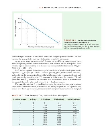
$12
Price (dollars per ounce) $7
$10
FIGURE 11.1 The Monopolist’s Demand
D Curve Is the Market Demand Curve
0 2 5 12 The market demand curve is D. To sell more, the
monopolist must charge less. But at what quantity
Quantity (millions of ounces per year)
will the monopolist maximize profit?
would charge a price of $10 per ounce. But to sell a higher quantity such as 5 million
ounces, the monopolist would have to lower its price to $7 per ounce.
As we move along the monopolist’s demand curve, different quantities and their
associated prices generate different amounts of total revenue for the monopolist. Total
revenue is price times quantity, so in this case the monopolist’s total revenue is TR(Q)
2
P(Q) Q 12Q Q .
Let’s further suppose that the monopolist’s total cost of production is given by the
2
equation TC(Q) (1/2)Q . Table 11.1 shows quantity, price, total revenue, total cost,
and profit for this monopolist. Figure 11.2(a) illustrates total revenue, total cost, and
profit graphically, revealing that TC increases as Q increases. By contrast, TR and
profit first rise as Q increases but then fall. The monopolist’s profit is maximized at
the peak of the profit hill, which occurs at Q 4 million ounces.
For quantities less than Q 4 million, increasing the output increases total revenues
more than it increases total cost, which moves the firm up its profit hill. As Figure 11.2(b)
shows, over this range of output, the monopolist’s marginal revenue exceeds its marginal
TABLE 11.1 Total Revenue, Cost, and Profit for a Monopolist
Q (million ounces) P ($/oz.) TR ($ million) TC ($ million) Profit ($ million)
0 12 0 0 0
1 11 11.00 0.50 10.50
2 10 20.00 2.00 18.00
3 9 27.00 4.50 22.50
4 8 32.00 8.00 24.00
5 7 35.00 12.50 22.50
6 6 36.00 18.00 18.00
7 5 35.00 24.50 10.50
8 4 32.00 32.00 0
9 3 27.00 40.50 13.50
10 2 20.00 50.00 30.00