
Page 140 - TX_Marketing 2_M1_v2
P. 140
20 percent were unsatisfied
He decides that a chart or graph of some kind might help make his numerical values
more digestible. He wants to select a type of graph that would best illustrate the
part/whole relationship between the satisfied group and those who were less
satisfied.
Given this, which of the following graphs would be the best choice?
Line graph
Bar graph
Pie chart
Venn diagram
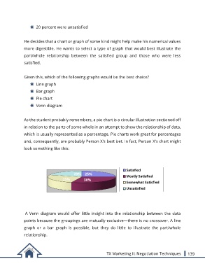
As the student probably remembers, a pie chart is a circular illustration sectioned off
in relation to the parts of some whole in an attempt to show the relationship of data,
which is usually represented as a percentage. Pie charts work great for percentages
and, consequently, are probably Person X's best bet. In fact, Person X's chart might
look something like this:
Satisfied
20% 25% Mostly Satisfied
25% 30%
Somewhat Satisfied
Unsatisfied
A Venn diagram would offer little insight into the relationship between the data
points because the groupings are mutually exclusive—there is no crossover. A line
graph or a bar graph is possible, but they do little to illustrate the part/whole
relationship.
TX Marketing II: Negotiation Techniques 139