
Page 43 - TX_Marketing 2_M1_v2
P. 43
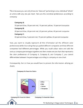
This is because you can only show one "data set" pertaining to one, individual "whole"

               at a time with any one pie chart. Here are the statistical preferences according to
               company:


                       Company A:
                       50 percent blue, 30 percent red, 10 percent yellow, 10 percent turquoise

                       Company B:

                       20 percent blue, 20 percent red, 20 percent yellow, 40 percent turquoise
                       Company C:

                       65 percent blue, 5 percent red, 15 percent yellow, 20 percent turquoise


               Now,  you  want  to  visually  represent  all  this  information  (all  the  different  color

               preferences) while illustrating that you polled different companies and that different

               companies  had  different  percentages.  While  you  could  utilize  ratios  and  add  the
               various company percentages together and then create one pie chart that represents

               the  color  preferences  of  Company  A,  Company  B,  and  Company  C,  you  cannot

               differentiate between the percentages according to company on one chart.


               Consequently, here is how you would have to present the information utilizing pie

               charts:

                          Company A's Favorite Colors


                                      10%
                                                              Blue
                                  10%                         Red
                                                50%           Yellow

                                  30%                         Turquoise


                  Company B's Favorite Colors          Company C's Favorite Colors

                                                                 TX Marketing II: Negotiation Techniques         42