
Page 6 - Data Visualization aligned
P. 6
Charts:
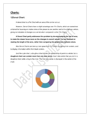
1)Donut Chart:
A donut chart is a Pie Chart with an area of the center cut out.
However, Donut Charts have a slight advantage over Pie Charts, which are sometimes
criticized for focusing on relative sizes of the pieces to one another and to the chart as a whole,
giving no indication of changes as a whole when compared to other Pie Charts.
A Donut Chart partly addresses this problem by de-emphasising the use of area,
to make the viewer focus more on the changes in overall values. You are focused on
reading the length of the arcs, rather then comparing the proportions between slices.
Also Donut Charts can take up less space then Pie Charts by having their centers used
to display information within their blank centers.
Just like a pie chart, a doughnut chart shows the relationship of parts to a whole, but a
doughnut chart can contain more than one data series. Each data series that you plot in a
doughnut chart adds a ring to the chart. The first data series is displayed in the center of the
chart.