
Page 11 - Data Visualization aligned
P. 11
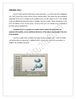
4)Bubble chart:


                       Column charts and line charts have 2 axes commonly – a numeric axis and a categorical

               axis. The Y-Axis is the numeric axis for column and line charts. This means that the quantitative
               magnitude of the plot is indicated by the position of the plot with respect to the Y-axis. Bubble
               charts are different because both axes of a bubble chart are numeric. Hence, the position of the

               plot is an indicator of two numeric values. The area of the plot is an indicator of the magnitude of
               the third numeric characteristic


                       A bubble chart is a variation of a scatter chart in which the data points are
               replaced with bubbles, and an additional dimension of the data is represented in the size

               of the bubbles.

                       Just like a scatter chart, a bubble chart does not use a category axis — both horizontal

               and vertical axes are value axes. In addition to the x values and y values that are plotted in a
               scatter chart, a bubble chart plots


                       .