
Page 14 - Data Visualization aligned
P. 14
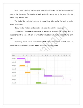
Gantt Charts are drawn within a table: rows are used for the activities and columns are

               used  as  the  time  scale.  The  duration  of  each  activity  is  represented  by  the  length  of  a  bar

               plotted along this time scale.

                       The start of the bar is the beginning of the activity and the end of the bar is when the


               activity should finish.

                        Colour-coding the bars can be used to categorise the activities into groups.

                       To  show  the  percentage  of  completion  of  an  activity,  a  bar  can  be  partially  filled  in,

               shaded differently or use a different colour, to differentiate between what is done and what is left

               to do.


                       Connecting arrows can be used to show which tasks are dependent on each other and

               vertical line running through the chart is used to highlight the current date.