
Page 12 - Data Visualization aligned
P. 12
Tools to Generate BubbleChart Visualisation:
AnyChart
Google Charts
Google Docs
RAWGraphs
Slemma
Visage
ZingChart
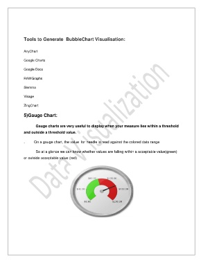
5)Gauge Chart:
Gauge charts are very useful to display when your measure lies within a threshold
and outside a threshold value.
. On a gauge chart, the value for needle is read against the colored data range
So at a glance we can know whether values are falling within a acceptable value(green)
or outside acceptable value (red)