
Page 8 - Data Visualization aligned
P. 8
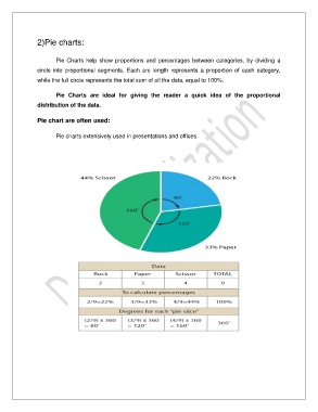
2)Pie charts:


                       Pie  Charts  help  show  proportions  and  percentages  between  categories,  by  dividing  a
               circle  into  proportional  segments.  Each  arc  length  represents  a  proportion  of  each  category,
               while the full circle represents the total sum of all the data, equal to 100%.


                       Pie  Charts  are  ideal  for  giving  the  reader  a  quick  idea  of  the  proportional
               distribution of the data.


               Pie chart are often used:


                       Pie charts extensively used in presentations and offices.