
Page 102 - Visual Marketing
P. 102
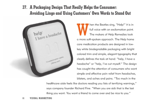
37. A Packaging Design That Really Helps the Consumer:
    Avoiding Lingo and Using Customers’ Own Words to Stand Out

         W hen the Beatles sing, “Help!” it is in
                                                                      full voice with an exclamation point.
                                                                      The makers of Help Remedies took
                                                         a more soft-spoken approach. The Help home
                                                         care medication products are designed in low-
                                                         key white biodegradable packaging with bright
                                                         colored trim and simple, elegant typography that
                                                         clearly defines the task at hand: “help, I have a
                                                         headache” or “help, I’ve cut myself.” The design
                                                         has caught the attention of consumers who want
                                                         simple and effective pain relief from headaches,
                                                         blisters, and aches and pains. “Too much in the
                         healthcare aisle feels like doctors reading you lists of terrifying warnings,”
                         says company founder Richard Fine. “When you are sick that is the last
                         thing you want: You want a friend to come over and be nice to you.”

81 V I S UA L M A RK ETIN G