Page 103 - Visual Marketing
P. 103
Why It Works                          Success Metrics                     Takeaway Tip

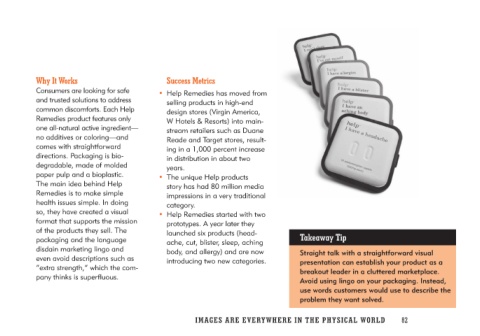
Consumers are looking for safe      • Help Remedies has moved from        Straight talk with a straightforward visual
and trusted solutions to address       selling products in high-end       presentation can establish your product as a
common discomforts. Each Help          design stores (Virgin America,     breakout leader in a cluttered marketplace.
Remedies product features only         W Hotels & Resorts) into main-     Avoid using lingo on your packaging. Instead,
one all-natural active ingredient—     stream retailers such as Duane     use words customers would use to describe the
no additives or coloring—and           Reade and Target stores, result-   problem they want solved.
comes with straightforward             ing in a 1,000 percent increase
directions. Packaging is bio-          in distribution in about two
degradable, made of molded             years.
paper pulp and a bioplastic.
The main idea behind Help           • The unique Help products
Remedies is to make simple             story has had 80 million media
health issues simple. In doing         impressions in a very traditional
so, they have created a visual         category.
format that supports the mission
of the products they sell. The      • Help Remedies started with two
packaging and the language             prototypes. A year later they
disdain marketing lingo and            launched six products (head-
even avoid descriptions such as        ache, cut, blister, sleep, aching
“extra strength,” which the com-       body, and allergy) and are now
pany thinks is superfluous.             introducing two new categories.

                                    IMAGES ARE EVERYWHERE IN THE PHY SI C A L W O R L D 82

