Page 123 - Visual Marketing
P. 123
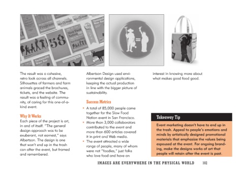
The result was a cohesive,          Albertson Design used envi-         interest in knowing more about
retro look across all channels.     ronmental design applications,      what makes good food good.
Silhouettes of farmers and farm     keeping the actual production
animals graced the brochures,       in line with the bigger picture of
tickets, and the website. The       sustainability.
result was a feeling of commu-
nity, of caring for this one-of-a-    Success Metrics                   Takeaway Tip
kind event.
                                    • A total of 85,000 people came     Event marketing doesn’t have to end up in
Why It Works                           together for the Slow Food       the trash. Appeal to people’s emotions and
                                       Nation event in San Francisco.   minds by artistically designed promotional
Each piece of the project is art,                                       materials that emphasize the values being
in and of itself. “The general      • More than 3,000 collaborators     espoused at the event. For ongoing brand-
design approach was to be              contributed to the event and     ing, make the designs works of art that
exuberant, not earnest,” says          more than 600 articles covered   people will retain after the event is past.
Albertson. The design is one           it in print and Web media.
that won’t end up in the trash
can after the event, but framed     • The event attracted a wide
and remembered.                        range of people, many of whom
                                       were not “foodies,” just folks
                                       who love food and have an

                                    IMAGES ARE EVERYWHERE IN THE PHY SIC A L W O R L D 102

