Page 121 - Visual Marketing
P. 121
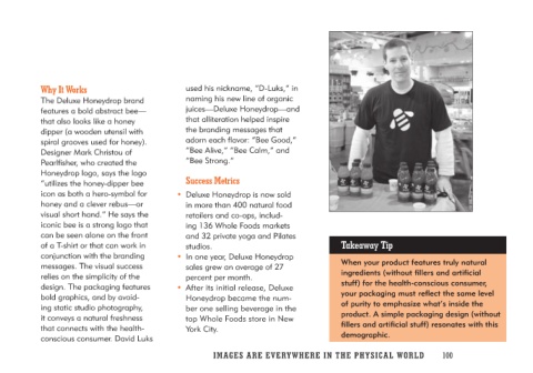
Why It Works                      used his nickname, “D-Luks,” in
                                  naming his new line of organic
The Deluxe Honeydrop brand        juices—Deluxe Honeydrop—and
features a bold abstract bee—     that alliteration helped inspire
that also looks like a honey      the branding messages that
dipper (a wooden utensil with     adorn each flavor: “Bee Good,”
spiral grooves used for honey).   “Bee Alive,” “Bee Calm,” and
Designer Mark Christou of         “Bee Strong.”
Pearlfisher, who created the
Honeydrop logo, says the logo       Success Metrics                    Takeaway Tip
“utilizes the honey-dipper bee
icon as both a hero-symbol for    • Deluxe Honeydrop is now sold       When your product features truly natural
honey and a clever rebus—or          in more than 400 natural food     ingredients (without fillers and artificial
visual short hand.” He says the      retailers and co-ops, includ-     stuff) for the health-conscious consumer,
iconic bee is a strong logo that     ing 136 Whole Foods markets       your packaging must reflect the same level
can be seen alone on the front       and 32 private yoga and Pilates   of purity to emphasize what’s inside the
of a T-shirt or that can work in     studios.                          product. A simple packaging design (without
conjunction with the branding                                          fillers and artificial stuff) resonates with this
messages. The visual success      • In one year, Deluxe Honeydrop      demographic.
relies on the simplicity of the      sales grew an average of 27
design. The packaging features       percent per month.
bold graphics, and by avoid-
ing static studio photography,    • After its initial release, Deluxe
it conveys a natural freshness       Honeydrop became the num-
that connects with the health-       ber one selling beverage in the
conscious consumer. David Luks       top Whole Foods store in New
                                     York City.

                                  IMAGES ARE EVERYWHERE IN THE PHY SIC A L W O R L D 100

