Page 51 - Visual Marketing
P. 51
Why It Works                           special section of the website          1st Place 2010 Electronic
                                       to explain the firm’s process            Professional award.
The firm’s clients in the past,         for understanding and solving        • The site looks and feels progres-
which included universities,           complex design problems, called         sive, and the perceived value of
health care groups, and religious      “Problem Seeking.” In this sec-         the firm’s services are greatly
organizations, had been spread         tion, subtle clues reinforce that       improved.
across northern Utah, but the          design is about uncovering and
firm wanted to focus more tightly       understanding, at a deep level,           Takeaway Tip
on regional projects.                  the client’s vision for the project
                                       (for instance, the words “con-              If you are in a professional services business,
We’d all like to pick our cli-         tinue learning” are used instead            keep your website simple, but do go beyond
ents, but it can be difficult.          of “read more” to advance to                just a portfolio of your work. Share a bit of
Architectural Nexus found a            the next point).                            your company philosophy. If the way you
way to do just that in how it                                                      handle projects is a competitive advantage,
presented itself through its site.    Success Metrics                              then outline your process. By understanding
Through its website redesign,                                                      your vision before contacting you, potential
Architectural Nexus was able to     • The website won several awards,              clients will get a better feel for whether your
narrow in on the type of work it       including a Utah Addy Awards                style of working and theirs are consistent.
wanted more of, and it did so by       2011 Silver Addy Award and                  And you will attract the kind of clients you
illustrating its progressive,          the Society for Marketing                   prefer to work with.
process-focused design approach.       Professional Services Utah’s

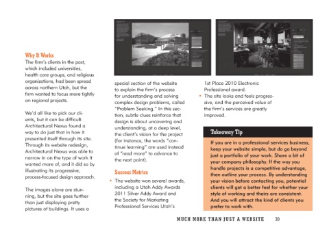
The images alone are stun-
ning, but the site goes further
than just displaying pretty
pictures of buildings. It uses a

                                    MUCH MO RE THAN JUST A W E BS I TE 30

