Page 145 - Visual Marketing
P. 145
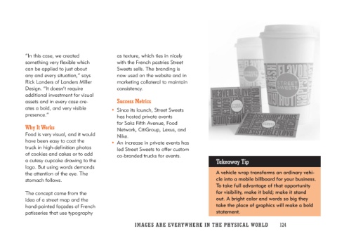
“In this case, we created          as texture, which ties in nicely
something very flexible which       with the French pastries Street
can be applied to just about       Sweets sells. The branding is
any and every situation,” says     now used on the website and in
Rick Landers of Landers Miller     marketing collateral to maintain
Design. “It doesn’t require        consistency.
additional investment for visual
assets and in every case cre-        Success Metrics
ates a bold, and very visible
presence.”                         • Since its launch, Street Sweets
                                      has hosted private events
Why It Works                          for Saks Fifth Avenue, Food
                                      Network, CitiGroup, Lexus, and
Food is very visual, and it would     Nike.
have been easy to coat the
truck in high-definition photos     • An increase in private events has
of cookies and cakes or to add        led Street Sweets to offer custom
a cutesy cupcake drawing to the       co-branded trucks for events.
logo. But using words demands
the attention of the eye. The                                            Takeaway Tip
stomach follows.
                                                                         A vehicle wrap transforms an ordinary vehi-
The concept came from the                                                cle into a mobile billboard for your business.
idea of a street map and the                                             To take full advantage of that opportunity
hand-painted façades of French                                           for visibility, make it bold; make it stand
patisseries that use typography                                          out. A bright color and words so big they
                                                                         take the place of graphics will make a bold
                                                                         statement.

                                   IMAGES ARE EVERYWHERE IN THE PHY SIC A L W O R L D 124

