
Page 61 - Visual Marketing
P. 61
Why It Works combination surfaced, represent- Stock Exchange (FTSE) and
ing an Ionic column from Greek led to a partnership with the
Shelton Smith insisted that the revivalist architecture, and a new European company.
logo say “I-P-O,” the financial identity emerged. The logo had • The new website was redesigned
shorthand for “initial public genuine Renaissance roots, and and reorganized to emphasize
offering.” They are IPO experts it actually said “IPO.” Investing the key sales offerings. This has
and are frequently quoted in the in IPOs is about discovering the increased research subscribers
Wall Street Journal and seen on future. Now Renaissance Capital and attracted new investors to
CNBC. But evoking the spirit of has a forward-looking logo that the IPO mutual fund.
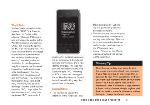
an IPO is an impossible task. “It’s pays tribute to the past. • A new IPO app for the iPhone
not a universal theme or concept was launched and has gained
like stability or trustworthiness Success Metrics 3,000 subscribers.
that we could build a design
around,” says design director • The new brand caught the Takeaway Tip
Jim Keller. So the design team attention of the Financial Times
sought to capture the themes of Over the years a logo may come to give
innovations and inventiveness the wrong impression about your company.
while building upon the clas- If your logo conveys an impression that is
sical forms of Renaissance art contrary to your firm’s capabilities and how
and architecture. They explored you want your market to think of your brand
Renaissance flags, fairs, build- today—or if it just seems tired and old-
ings, inventions, and da Vinci fashioned—then it’s time for a logo overhaul.
drawings. “But the client insisted A fresh choice of colors, design, tagline, and
it read as ‘IPO,’” says Keller. So font can make a powerful difference, without
they went back and pored over having to change your brand name.
the letters “IPO” repeatedly. A
MUCH MO RE THAN JUST A W E BS I TE 40