Page 65 - Visual Marketing
P. 65
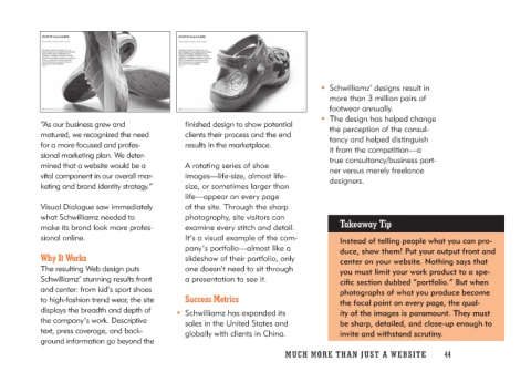
“As our business grew and                finished design to show potential    • Schwilliamz’ designs result in
matured, we recognized the need          clients their process and the end      more than 3 million pairs of
for a more focused and profes-           results in the marketplace.            footwear annually.
sional marketing plan. We deter-
mined that a website would be a          A rotating series of shoe           • The design has helped change
vital component in our overall mar-      images—life-size, almost life-         the perception of the consul-
keting and brand identity strategy.”     size, or sometimes larger than         tancy and helped distinguish
                                         life—appear on every page              it from the competition—a
Visual Dialogue saw immediately          of the site. Through the sharp         true consultancy/business part-
what Schwilliamz needed to               photography, site visitors can         ner versus merely freelance
make its brand look more profes-         examine every stitch and detail.       designers.
sional online.                           It’s a visual example of the com-
                                         pany’s portfolio—almost like a           Takeaway Tip
Why It Works                             slideshow of their portfolio, only
                                         one doesn’t need to sit through            Instead of telling people what you can pro-
The resulting Web design puts            a presentation to see it.                  duce, show them! Put your output front and
Schwilliamz’ stunning results front                                                 center on your website. Nothing says that
and center: from kid’s sport shoes      Success Metrics                             you must limit your work product to a spe-
to high-fashion trend wear, the site                                                cific section dubbed “portfolio.” But when
displays the breadth and depth of     • Schwilliamz has expanded its                photographs of what you produce become
the company’s work. Descriptive          sales in the United States and             the focal point on every page, the qual-
text, press coverage, and back-          globally with clients in China.            ity of the images is paramount. They must
ground information go beyond the                                                    be sharp, detailed, and close-up enough to
                                                                                    invite and withstand scrutiny.

                                      MUCH MO RE THAN JUST A W E BS I TE 44

