Page 534 - Krugmans Economics for AP Text Book_Neat
P. 534
the figure, the price is $5 per bushel and farmers supply 1 million bushels. What is the
                                       benefit to the farmers from selling their wheat at a price of $5? Their producer surplus
                                       is equal to the shaded area in the figure—the area above the supply curve but below the
                                       price of $5 per bushel.


                                       How Changing Prices Affect Producer Surplus
                                       As in the case of consumer surplus, a change in price alters producer surplus. However,
                                       although a fall in price increases consumer surplus, it reduces producer surplus. Simi-
                                       larly, a rise in price reduces consumer surplus but increases producer surplus.
                                          To see this, let’s first consider a rise in the price of the good. Producers of the good
                                       will experience an increase in producer surplus, though not all producers gain the same
                                       amount. Some producers would have produced the good even at the original price;
                                       they will gain the entire price increase on every unit they produce. Other producers will
                                       enter the market because of the higher price; they will gain only the difference between
                                       the new price and their cost.
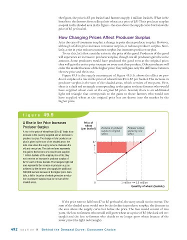
                                          Figure 49.9 is the supply counterpart of Figure 49.5. It shows the effect on pro-
                                       ducer surplus of a rise in the price of wheat from $5 to $7 per bushel. The increase in
                                       producer surplus is the sum of the shaded areas, which consists of two parts. First,
                                       there is a dark red rectangle corresponding to the gains to those farmers who would
                                       have supplied wheat even at the original $5 price. Second, there is an additional
                                       light red triangle that corresponds to the gains to those farmers who would not
                                       have supplied wheat at the original price but are drawn into the market by the
                                       higher price.


                figure 49.9


                A Rise in the Price Increases           Price of
                Producer Surplus                         wheat     Increase in producer   Producer surplus
                                                      (per bushel)
                A rise in the price of wheat from $5 to $7 leads to an  surplus to original   gained by new   S
                                                                   sellers           sellers
                increase in the quantity supplied and an increase in
                producer surplus. The change in total producer sur-
                plus is given by the sum of the shaded areas: the  $7
                total area above the supply curve but between the
                old and new prices. The dark red area represents
                the gain to the farmers who would have supplied   5
                1 million bushels at the original price of $5; they
                each receive an increase in producer surplus of
                $2 for each of those bushels. The triangular light red
                area represents the increase in producer surplus
                achieved by the farmers who supply the additional
                500,000 bushels because of the higher price. Simi-
                larly, a fall in the price of wheat generates a reduc-
                tion in producer surplus equal to the sum of the
                shaded areas.                                  0                1 million  1.5 million
                                                                                       Quantity of wheat (bushels)


                                          If the price were to fall from $7 to $5 per bushel, the story would run in reverse. The
                                       sum of the shaded areas would now be the decline in producer surplus, the decrease in
                                       the area above the supply curve but below the price. The loss would consist of two
                                       parts, the loss to farmers who would still grow wheat at a price of $5 (the dark red rec-
                                       tangle) and the loss to farmers who decide to no longer grow wheat because of the
                                       lower price (the light red triangle).

        492   section 9     Behind the Demand Curve: Consumer Choice

