Page 13 - The Great 401k Rip-Off
P. 13
initial withdrawal rate of 2.8%. Such a low withdrawal rate would require 42.9%
         more savings if the retiree wanted to pull the same dollar value out of the
         portfolio annually as he or she would get with a 4% withdrawal rate from a
         smaller portfolio. [18]

Again, just spend less. Problem fixed! Moreover, such significant losses are not as aberrational as
some might think. Says Kent Osband, in Iceberg Risk: An Adventure in Portfolio Theory:

         Even in large portfolios, high standard‐deviation events tend to occur far more
         often than a normal distribution suggests. This seems especially true on the
         downside. Call this variable excess risk ‘iceberg risk,’ because it is mostly hidden
         from view but threatens major damage. It might also be called ‘Noah risk,’ after
         the proverbial flood that drowned the world. Also, in the Biblical story, the world
         was amply warned about the flood but refused to listen. In contrast, icebergs
         reflect a type of risk that people look for but may not see. [19]

When severe “black swan” events happen early on during retirement in an individual retiree’s
portfolio, which is also providing income, the personal costs are often catastrophic. The crucial risk to
investing in stocks isn’t the chance that a retiree’s rate of return might vary from historical averages,
it is the possibility that stocks might wipe him or her out. That risk never goes away, no matter how
long the investor stays in Wall Street.
Advisors will tell you a longer horizon provides more opportunities to recover from “extreme market
conditions,” but it also provides more opportunities to experience them, which is often lost on
investors and downplayed by their Wall Street‐oriented advisors.


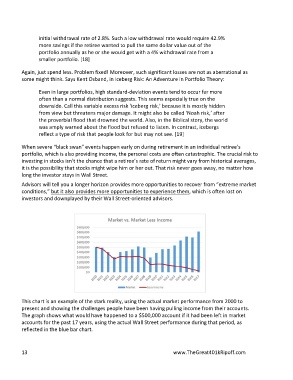
This chart is an example of the stark reality, using the actual market performance from 2000 to
present and showing the challenges people have been having pulling income from their accounts.
The graph shows what would have happened to a $500,000 account if it had been left in market
accounts for the past 17 years, using the actual Wall Street performance during that period, as
reflected in the blue bar chart.

13  www.TheGreat401kRipoff.com


