
Page 180 - Cambridge+Checkpoint+Mathematics+Coursebook+9
P. 180
19.1 Interpreting and drawing frequency diagrams
) Exercise 19.1
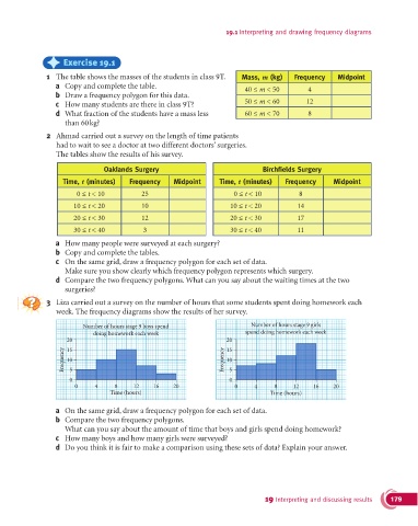
1 The table shows the masses of the students in class 9T. Mass, m (kg) Frequency Midpoint
a Copy and complete the table. 40 ≤ m < 50 4
b Draw a frequency polygon for this data.
c How many students are there in class 9T? 50 ≤ m < 60 12
d What fraction of the students have a mass less 60 ≤ m < 70 8
than 60 kg?
2 Ahmad carried out a survey on the length of time patients
had to wait to see a doctor at two different doctors’ surgeries.
The tables show the results of his survey.
Oaklands Surgery Birchfields Surgery
Time, t (minutes) Frequency Midpoint Time, t (minutes) Frequency Midpoint
0 ≤ t < 10 25 0 ≤ t < 10 8
10 ≤ t < 20 10 10 ≤ t < 20 14
20 ≤ t < 30 12 20 ≤ t < 30 17
30 ≤ t < 40 3 30 ≤ t < 40 11
a How many people were surveyed at each surgery?
b Copy and complete the tables.
c On the same grid, draw a frequency polygon for each set of data.
Make sure you show clearly which frequency polygon represents which surgery.
d Compare the two frequency polygons. What can you say about the waiting times at the two
surgeries?
3 Liza carried out a survey on the number of hours that some students spent doing homework each
week. The frequency diagrams show the results of her survey.
Number of hours stage 9 boys spend Number of hours stage 9 girls
doing homework each week spend doing homework each week
20 20
15
15
Frequency 10 Frequency 10 5
5
0 0
0 4 8 12 16 20 0 4 8 12 16 20
Time (hours) Time (hours)
a On the same grid, draw a frequency polygon for each set of data.
b Compare the two frequency polygons.
What can you say about the amount of time that boys and girls spend doing homework?
c How many boys and how many girls were surveyed?
d Do you think it is fair to make a comparison using these sets of data? Explain your answer.
19 Interpreting and discussing results 179