
Page 184 - Cambridge+Checkpoint+Mathematics+Coursebook+9
P. 184
19.3 Interpreting and drawing scatter graphs
) Exercise 19.3
1 Hassan carried out a survey on 15 students in his class. He asked them how many hours a week
they spend on homework, and how many hours a week they watch the TV.
The table shows the results of his survey.
Hours doing homework 14 11 19 6 10 3 9 4 12 8 6 15 18 7 12
Hours watching TV 7 12 4 15 11 18 15 17 8 14 16 7 5 16 10
a Draw a scatter graph to show this data. Mark each axis with a scale from 0 to 20. Show ‘Hours
doing homework’ on the horizontal axis and ‘Hours watching TV’ on the vertical axis.
b What type of correlation does the scatter graph show? Explain your answer.
2 The table shows the history and music exam results of 15 students.
The results for both subjects are given as percentages.
History result 12 15 22 25 32 36 45 52 58 68 75 77 80 82 85
Music result 25 64 18 42 65 23 48 24 60 45 68 55 42 32 76
a Draw a scatter graph to show this data. Mark a scale from 0 to 100 on each axis.
Show ‘History result’ on the horizontal axis as and ‘Music result’ on the vertical axis.
b What type of correlation does the scatter graph show? Explain your answer.
3 The table shows the maximum daytime temperature in a town over a period of 14 days.
It also shows the number of cold drinks sold at a vending machine each day over the
same 14-day period.
Maximum daytime temperature (°C) 28 26 30 31 34 32 27 25 26 28 29 30 33 27
Number of cold drinks sold 25 22 26 28 29 27 24 23 24 27 26 29 31 23
a Draw a scatter graph to show this data.
Show ‘Maximum daytime temperature’ on the horizontal axis, with a scale from 25 to 35.
Show ‘Number of cold drinks sold’ on the vertical axis, with a scale from 20 to 32.
b What type of correlation does the scatter graph show? Explain your answer.
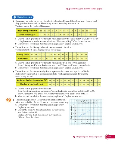
4 The scatter graph shows the distance travelled and the time Scatter graph of distance travelled
taken by a taxi driver for the 12 journeys he made on one day. and time taken by taxi driver
a What type of correlation does the scatter graph show?
Explain your answer. 20
b One of the journeys doesn’t seem to fit the correlation. 15
Which journey is this? Time taken (minutes) 25
Explain why you think this journey may have been 10
different from the others. 5
0
0 5 10 15 20
Distance travelled (km)
19 Interpreting and discussing results 183