
Page 188 - Cambridge+Checkpoint+Mathematics+Coursebook+9
P. 188
19.5 Comparing distributions and drawing conclusions
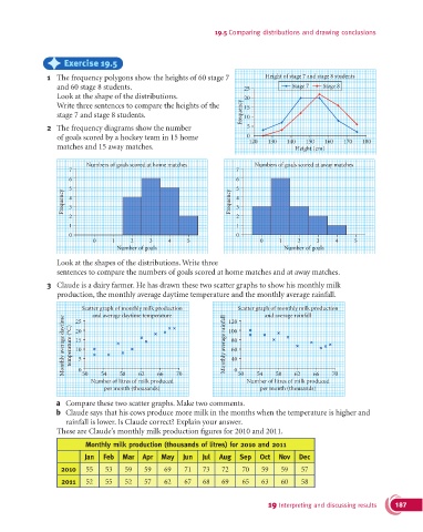
) Exercise 19.5
1 The frequency polygons show the heights of 60 stage 7 Height of stage 7 and stage 8 students
and 60 stage 8 students. 25 Stage 7 Stage 8
Look at the shape of the distributions. 20
Write three sentences to compare the heights of the 15
stage 7 and stage 8 students. Frequency 10
2 The frequency diagrams show the number 5
of goals scored by a hockey team in 15 home 0 120 130 140 150 160 170 180
matches and 15 away matches. Height (cm)
Numbers of goals scored at home matches Numbers of goals scored at away matches
7 7
6 6
5 5
Frequency 4 Frequency 4
3
3
2 2
1 1
0 0
0 1 2 3 4 5 0 1 2 3 4 5
Number of goals Number of goals
Look at the shapes of the distributions. Write three
sentences to compare the numbers of goals scored at home matches and at away matches.
3 Claude is a dairy farmer. He has drawn these two scatter graphs to show his monthly milk
production, the monthly average daytime temperature and the monthly average rainfall.
Scatter graph of monthly milk production Scatter graph of monthly milk production
and average daytime temperature 120 and average rainfall
Monthly average daytime temperature (°C) 20 Monthly average rainfall 100
25
15
80
60
10
40
5
0
66
62
62
58
54
58
50
66
54
Number of litres of milk produced 70 0 50 Number of litres of milk produced 70
per month (thousands) per month (thousands)
a Compare these two scatter graphs. Make two comments.
b Claude says that his cows produce more milk in the months when the temperature is higher and
rainfall is lower. Is Claude correct? Explain your answer.
These are Claude’s monthly milk production figures for 2010 and 2011.
Monthly milk production (thousands of litres) for 2010 and 2011
Jan Feb Mar Apr May Jun Jul Aug Sep Oct Nov Dec
2010 55 53 59 59 69 71 73 72 70 59 59 57
2011 52 55 52 57 62 67 68 69 65 63 60 58
19 Interpreting and discussing results 187