
Page 189 - Cambridge+Checkpoint+Mathematics+Coursebook+9
P. 189
19.5 Comparing distributions and drawing conclusions
Claude says that, on average, his cows produced more milk per month in 2010 than 2011, but his
milk production was more consistent in 2011.
c Is Claude correct? Explain your answer.
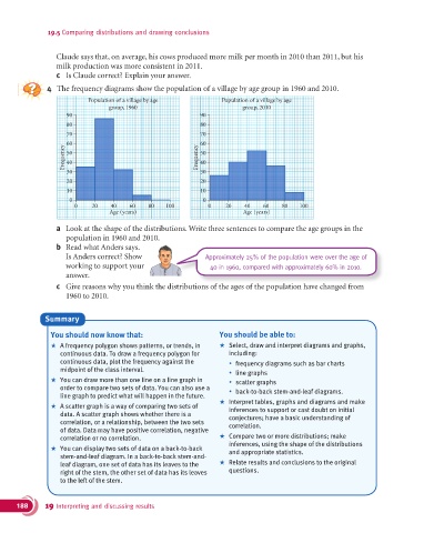
4 The frequency diagrams show the population of a village by age group in 1960 and 2010.
Population of a village by age Population of a village by age
group, 1960 group, 2010
90 90
80 80
70 70
60 60
Frequency 50 Frequency 50
40
40
30 30
20 20
10 10
0 0
0 20 40 60 80 100 0 20 40 60 80 100
Age (years) Age (years)
a Look at the shape of the distributions. Write three sentences to compare the age groups in the
population in 1960 and 2010.
b Read what Anders says.
Is Anders correct? Show Approximately 25% of the population were over the age of
working to support your 40 in 1960, compared with approximately 60% in 2010.
answer.
c Give reasons why you think the distributions of the ages of the population have changed from
Give reasons why you think the distributions of the ages of the population have changed from
1960 to 2010.
Summary
You should now know that: You should be able to:
+ A frequency polygon shows patterns, or trends, in + Select, draw and interpret diagrams and graphs,
continuous data. To draw a frequency polygon for including:
continuous data, plot the frequency against the % frequency diagrams such as bar charts
midpoint of the class interval. % line graphs
+ You can draw more than one line on a line graph in % scatter graphs
order to compare two sets of data. You can also use a % back-to-back stem-and-leaf diagrams.
line graph to predict what will happen in the future.
+ Interpret tables, graphs and diagrams and make
+ A scatter graph is a way of comparing two sets of inferences to support or cast doubt on initial
data. A scatter graph shows whether there is a conjectures; have a basic understanding of
correlation, or a relationship, between the two sets correlation.
of data. Data may have positive correlation, negative
correlation or no correlation. + Compare two or more distributions; make
inferences, using the shape of the distributions
+ You can display two sets of data on a back-to-back and appropriate statistics.
stem-and-leaf diagram. In a back-to-back stem-and-
leaf diagram, one set of data has its leaves to the + Relate results and conclusions to the original
right of the stem, the other set of data has its leaves questions.
to the left of the stem.
188 19 Interpreting and discussing results