
Page 181 - Cambridge+Checkpoint+Mathematics+Coursebook+9
P. 181
19.2 Interpreting and drawing line graphs
19.2 Interpreting and drawing line graphs
Line graphs show how data changes over a period of time. A line graph shows a trend.
You can draw more than one line on a line graph, to help you to compare two sets of data.
You can also use a line graph to predict what will happen in the future.
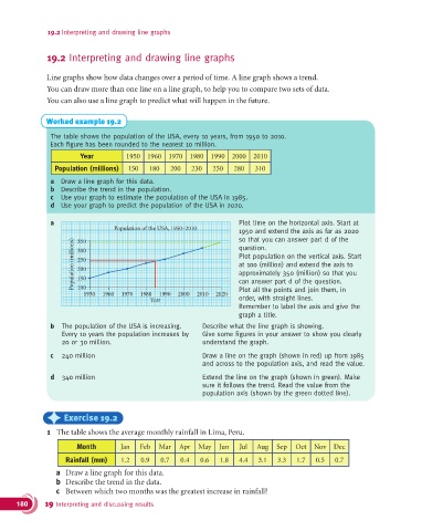
Worked example 19.2
The table shows the population of the USA, every 10 years, from 1950 to 2010.
Each figure has been rounded to the nearest 10 million.
Year 1950 1960 1970 1980 1990 2000 2010
Population (millions) 150 180 200 230 250 280 310
a Draw a line graph for this data.
b Describe the trend in the population.
c Use your graph to estimate the population of the USA in 1985.
d Use your graph to predict the population of the USA in 2020.
a Plot time on the horizontal axis. Start at
Population of the USA, 1950–2010
1950 and extend the axis as far as 2020
so that you can answer part d of the
Population (millions) 300 Plot population on the vertical axis. Start
350
question.
250
at 100 (million) and extend the axis to
200
approximately 350 (million) so that you
150
100
Plot all the points and join them, in
1950 1960 1970 1980 1990 2000 2010 2020 can answer part d of the question.
Year order, with straight lines.
Remember to label the axis and give the
graph a title.
b The population of the USA is increasing. Describe what the line graph is showing.
Every 10 years the population increases by Give some figures in your answer to show you clearly
20 or 30 million. understand the graph.
c 240 million Draw a line on the graph (shown in red) up from 1985
and across to the population axis, and read the value.
d 340 million Extend the line on the graph (shown in green). Make
sure it follows the trend. Read the value from the
population axis (shown by the green dotted line).
) Exercise 19.2
1 The table shows the average monthly rainfall in Lima, Peru.
Month Jan Feb Mar Apr May Jun Jul Aug Sep Oct Nov Dec
Rainfall (mm) 1.2 0.9 0.7 0.4 0.6 1.8 4.4 3.1 3.3 1.7 0.5 0.7
a Draw a line graph for this data.
b Describe the trend in the data.
c Between which two months was the greatest increase in rainfall?
180 19 Interpreting and discussing results