Page 197 - Visual Marketing
P. 197
Why It Works                        Success Metrics                  Takeaway Tip

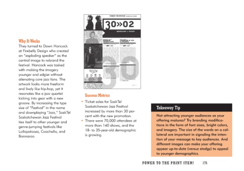
They turned to Dawn Hancock       • Ticket sales for SaskTel         Not attracting younger audiences as your
at Firebelly Design who created      Saskatchewan Jazz Festival      offering matures? Try branding modifica-
an “exploding speaker” as the        increased by more than 30 per-  tions in the form of font sizes, bright colors,
central image to rebrand the         cent with the new promotion.    and imagery. The size of the words on a col-
festival. Hancock was tasked                                         lateral are important in signaling the inten-
with making the imagery           • There were 70,000 attendees at   tion of your message to key audiences. And
younger and edgier without           more than 140 shows, and the    different images can make your offering
alienating core jazz fans. The       18- to 35-year-old demographic  appear up-to-date (versus stodgy) to appeal
artwork looks more freeform          is growing.                     to younger demographics.
and lively like hip-hop, yet it
resonates like a jazz quartet
kicking into gear with a new
groove. By increasing the type
size of “Festival” in the name
and downplaying “Jazz,” SaskTel
Saskatchewan Jazz Festival
ties itself to other younger and
genre-jumping festivals like
Lollapalooza, Coachella, and
Bonnaroo.

                                                                     PO WER TO THE PR I N T I TE M ! 176

