Page 81 - Visual Marketing
P. 81
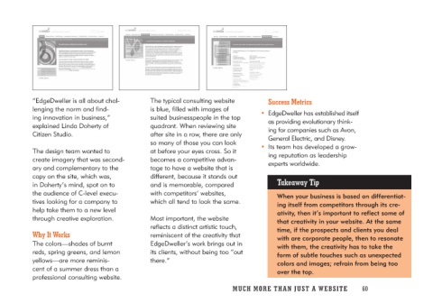
“EdgeDweller is all about chal-   The typical consulting website         Success Metrics
lenging the norm and find-         is blue, filled with images of
ing innovation in business,”      suited businesspeople in the top     • EdgeDweller has established itself
explained Linda Doherty of        quadrant. When reviewing site           as providing evolutionary think-
Citizen Studio.                   after site in a row, there are only     ing for companies such as Avon,
                                  so many of those you can look           General Electric, and Disney.
The design team wanted to         at before your eyes cross. So it
create imagery that was second-   becomes a competitive advan-         • Its team has developed a grow-
ary and complementary to the      tage to have a website that is          ing reputation as leadership
copy on the site, which was,      different, because it stands out        experts worldwide.
in Doherty’s mind, spot on to     and is memorable, compared
the audience of C-level execu-    with competitors’ websites,               Takeaway Tip
tives looking for a company to    which all tend to look the same.
help take them to a new level                                                 When your business is based on differentiat-
through creative exploration.     Most important, the website                 ing itself from competitors through its cre-
                                  reflects a distinct artistic touch,          ativity, then it’s important to reflect some of
Why It Works                      reminiscent of the creativity that          that creativity in your website. At the same
                                  EdgeDweller’s work brings out in            time, if the prospects and clients you deal
The colors—shades of burnt        its clients, without being too “out         with are corporate people, then to resonate
reds, spring greens, and lemon    there.”                                     with them, the creativity has to take the
yellows—are more reminis-                                                     form of subtle touches such as unexpected
cent of a summer dress than a                                                 colors and images; refrain from being too
professional consulting website.                                              over the top.

                                  MUCH MO RE THAN JUST A W E BS I TE 60

