Page 87 - Visual Marketing
P. 87
SEATTLE

                                      KIDS

                                      DENTISTRY

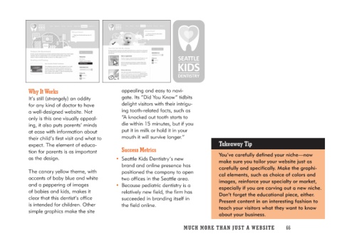
Why It Works                             appealing and easy to navi-           Takeaway Tip
                                         gate. Its “Did You Know” tidbits
It’s still (strangely) an oddity         delight visitors with their intrigu-  You’ve carefully defined your niche—now
for any kind of doctor to have           ing tooth-related facts, such as      make sure you tailor your website just as
a well-designed website. Not             “A knocked out tooth starts to        carefully and specifically. Make the graphi-
only is this one visually appeal-        die within 15 minutes, but if you     cal elements, such as choice of colors and
ing, it also puts parents’ minds         put it in milk or hold it in your     images, reinforce your specialty or market,
at ease with information about           mouth it will survive longer.”        especially if you are carving out a new niche.
their child’s first visit and what to                                           Don’t forget the educational piece, either.
expect. The element of educa-           Success Metrics                        Present content in an interesting fashion to
tion for parents is as important                                               teach your visitors what they want to know
as the design.                        • Seattle Kids Dentistry’s new           about your business.
                                         brand and online presence has
The canary yellow theme, with            positioned the company to open
accents of baby blue and white           two offices in the Seattle area.
and a peppering of images
of babies and kids, makes it          • Because pediatric dentistry is a
clear that this dentist’s office          relatively new field, the firm has
is intended for children. Other          succeeded in branding itself in
simple graphics make the site            the field online.

                                      MUCH MO RE THAN JUST A W E BS I TE 66

