Page 29 - Visual Marketing
P. 29
Why It Works                           information, and see the details  Takeaway Tip
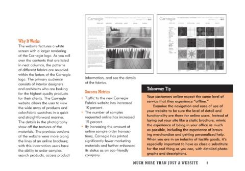
                                       of the fabrics.
The website features a white                                             Your customers online expect the same level of
screen with a larger rendering        Success Metrics                    service that they experience “offline.”
of the Carnegie logo. As you roll
over the contents that are listed   • Traffic to the new Carnegie             Examine the navigation and ease of use of
in neat columns, the patterns          Fabrics website has increased     your website to be sure the level of detail and
of different fabrics are revealed      10 percent.                       functionality are there for online users. Instead of
within the letters of the Carnegie                                       laying out your site like a static brochure, mimic
logo. The primary audience          • The number of samples              the experience of being in your office as much
consists of interior designers         requested online has increased    as possible, including the experience of brows-
and architects who are looking         15 percent.                       ing merchandise and getting personalized help.
for the highest-quality products                                         When you are in an industry of tactile goods, it’s
for their clients. The Carnegie     • By increasing the amount of        especially important to have as close a substitute
website allows the user to view        online sample order transac-      for the real thing as you can, with detailed photo-
the wide array of products and         tions, Carnegie has printed       graphs and descriptions.
color/fabric swatches in a quick       significantly fewer marketing
and straightforward manner.            materials and further enhanced
The details in the photography         its status as an eco-friendly
show off the textures of the           company.
materials. The previous versions
of the website were more along
the lines of an online brochure;
with this incarnation users have
the ability to order samples,
search products, access product

                                    MUCH MORE THAN JUST A WEBSITE 8

