Page 81 - FASTSIGNS Case Study Book
P. 81
INTERNATIONAL


            The Hive                                                HEALTHCARE AND SOCIAL ASSISTANCE


            Signage that Encourages Community
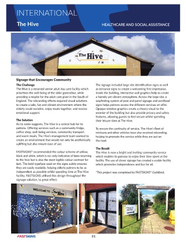
            The Challenge                                       The signage included large site identification signs as well
            The Hive is a renamed senior adult day care facility which   as entrance signs to create a welcoming first impression.
            prioritises the well-being of the older generation, while   Inside the building, interactive wall graphics help to create
            providing a respite for the adult care giver in the South of   a homely yet vibrant atmosphere . Across the large site, a
            England. The rebranding efforts required visual solutions   wayfinding system of post and panel signage and overhead
            to create a safe, fun and vibrant environment where the   signs helps patrons access the different services on offer.
            elderly could socialize, enjoy meals together, and receive   Opaque window graphics create a cheery visual to the
            emotional support.                                  exterior of the building but also provide privacy and safety
                                                                features, allowing guests to feel secure whilst spending
            The Solution                                        their leisure time at The Hive.
            As its name suggests, The Hive is a central hub for its
            patrons. Offering services such as a community fridge,   To ensure the continuity of service, The Hive’s fleet of
            coffee shop, well-being services, community transport   minivans and other vehicles have also received rebranding,
            and warm meals, The Hive’s management team wanted to   helping to promote the service while they are out on
            create an environment that would not only be aesthetically   the road .
            uplifting but also ensure ease of use.
                                                                The Result
            FASTSIGNS  recommended the colour scheme of yellow,   The Hive is now a bright and inviting community service
                      ®
            black and white, which is not only indicative of bees returning   which enables its patrons to enjoy their time spent at the
            to the hive but is also the most legible colour contrast for   facility . The use of clever signage has created a usable facility
            text . The bold typeface used on the signs subtly ensures   which promotes independence and fun for all .
            they are easily readable, helping elderly patrons to be as
            independent as possible whilst spending time at The Hive   *This project was completed by FASTSIGNS  Guildford.
                                                                                                    ®
            facility. FASTSIGNS utilised this design throughout the
            signage solution, to great effect.


                                                             81

