Page 85 - FASTSIGNS Case Study Book
P. 85
INTERNATIONAL


            Must Have Ideas
        TruNorth Construction                                                                    RETAIL/AUTO


            Growing eCommerce Start-up Business Establishes Brand with Visual Solutions
            The Challenge                                       The company’s van was also wrapped with a similar design
            After a period of extreme growth, Must Have Ideas moved   to the window graphics, helping to ensure that the brand is
            their start-up business out of their garage and into a 2000   noticed over every mile the vehicle travels.
            square foot premises, which would house both their offices
            and warehouse . At their new site, they needed to establish   Inside the building, FASTSIGNS created a range of signage
            their brand and effective working practices to cement their   which tied in Must Have Ideas branding but also provided
            position as a key eCommerce retailer.               information that helped staff navigate the building. Clearly
                                                                marked locations helped to deliver organisation within the
            The Solution                                        building and optimum service delivery. Signage included bay
            The directors at Must Have Ideas wanted to utilise the   labels, overhead signage and delivery information signage.
            vast exterior of their building to attract attention to their
            business and build brand recognition, however, they had not   FASTSIGNS worked with Must Have Ideas from conception
            considered how their signage could extend to the interior of   to installation and even organised planning permission for
            their building and help create an effective workspace that   the installation. They helped them make their statement,
            promoted service capabilities and build brand culture.  showcase their exponential growth and proudly display their
                                                                company branding .
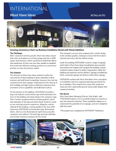
            On the exterior of the building, FASTSIGNS  provided a
                                                ®
            large internally lit, round exterior sign which dominates the   The Result
            front of the building and clearly depicts the company’s logo .   Must Have Ideas Managing Director, Rob Knight, said
            This is further complemented by window graphics, which   “FASTSIGNS helped us to successfully display our brand in a
            take elements of the logo and other brand visuals to create   way that demands attention. Their capabilities helped us to
            an eye-catching entrance experience. Along the exterior   understand the potential of our signage, and we’re delighted
            sidewall of the building, running parallel to the busy M20   with the result .”
            motorway, FASTSIGNS recommended large dimensional                                       ®
            letters, which can be illuminated at night showcasing the   *This project was completed by FASTSIGNS  Maidstone.
            company’s web address. This bold sign demands attention
            and ensures maximum exposure for the brand .


                                                             85

