Page 67 - Fredo Eyong
P. 67
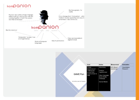
Red typography  for
                                                                                                                             clarity


                 The icon also carries a huge massage
                 within it self as it can be seen with the                                                 It is a change from ‘Companion’ , which
                 coming together of both the person                                                        makes it visually appealing and easy to
                 and their enviroment                                                                      remember. It also stands out.


            Red for stand out


                                  ‘Kompanion’ evokes ‘love
                                  and togetherness’                                                                        Clear and readable in

                                                                                              Easy to pronounce            digital formats
                                                               Works in European
                                                               languages


                                                                                                                                                              Goal                 Action               Measurment           Evaluation
                                                                                                                                                              Create               Advertising          80% Brand            Quantitative
                                                                                                                                                              Awareness of                              awareness            Research
                                                                                                                                                              ‘Walking aid’        Creative
                                                                                                                                                              product and          ‘togetherness’
                                                                                                                                     GAME Plan                communicate its
                                                                                                                                                              KBB                  Video Campaign
                                                                                                                                                                                   Social Media
                                                                                                                                                                                   Campaign

                                                                                                                                   List ac�vity, reach and frequency               Owned Medial

