Page 48 - Process Book A3_Giacomo Grech
P. 48
MID-FIDELITY PROTOTYPING & COLOUR BRANDING                                                                                                    -
                                                                                  -
                                                                                                                   -


                                                                              l b                                      l b
                     SETU Homepage                    Log in page                             Testing SETU Branding
                             ore et
                            a iusmo  o  i  t              a ore et  o  i  t                            a iusmo  o  i    t
                                                          iusmo
                                                                                                        ore et


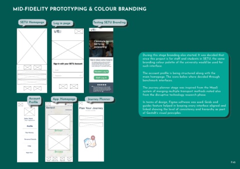
                                                                                                                                               During this stage branding also started. It was decided that
                                                                                                                                               since this project is for staff and students in SETU, the same
                                                                                                                                               branding colour palette of the university would be used for
                                                                                                                                               such interface.


                                                                                                                                               The account profile is being structured along with the
                                                                                                                                               main homepage. The icons below where decided through
                                                                                                                                               benchmark interfaces.


                                                                                                                                               The journey planner stage was inspired from the MaaS

                                                                                           -                      -                            system of merging multiple transport methods noted also
                                                                                                                                                    -
                                                                                                                                               from the disruptive technology research phase.
                              Account                App. Homepage                       Journey Planner
                                                     l b
                                                                        t
                                                                     i
                                                           iusmo
                                                                                                            t
                                                                                                        i
                                                                                              iusmo
                              Profile  t                   a  ore et   o     l b             a  ore et   o     l b                             In terms of design, Figma software was used. Grids and
                                iusmo
                                     i
                                a ore et  o
                                                                                                                                               guides feature helped in keeping every interface aligned and
                                                                                                                                               linked showing the level of consistency and hierarchy as part
                                                                                                                                               of Gestalt’s visual principles.


                                                                                                                                                                                                                                      P.48

